
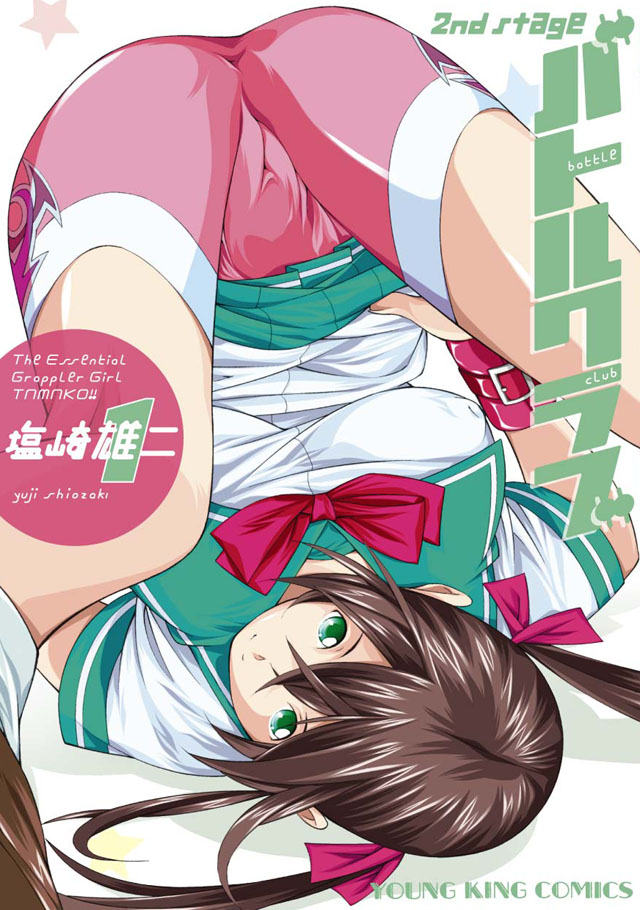

2008年4月1日発行
リニューアルです。
ポップできゃわいく、イマ風に。
ロゴは行きつけのピアノバーのカウンターで思案。
作者名や英語フォントは、「角を丸くする」効果の直線で構成。気に入ってます。
何より気に入ってるのは……そう、毎回の写真撮影がなくなったこと。こりゃ楽だ!!
2008年4月1日発行
リニューアルです。
ポップできゃわいく、イマ風に。
ロゴは行きつけのピアノバーのカウンターで思案。
作者名や英語フォントは、「角を丸くする」効果の直線で構成。気に入ってます。
何より気に入ってるのは……そう、毎回の写真撮影がなくなったこと。こりゃ楽だ!!
No related posts.
We use cookies to improve your experience on our site. By using our site, you consent to cookies.
Manage your cookie preferences below:
Essential cookies enable basic functions and are necessary for the proper function of the website.
These cookies are needed for adding comments on this website.
These cookies are used for managing login functionality on this website.
Statistics cookies collect information anonymously. This information helps us understand how visitors use our website.
Google Analytics is a powerful tool that tracks and analyzes website traffic for informed marketing decisions.
Service URL: policies.google.com (opens in a new window)


コメントを残す